Table of Contents
ToggleBare kitchen walls feel unfinished, like a cabinet door hanging on one hinge. But slapping up random art or cluttering every surface with cutesy signs won’t elevate the space. Classy kitchen wall decor sits at the intersection of function and restraint, where every piece earns its place through beauty, utility, or both. Whether working with a farmhouse aesthetic, modern minimalism, or traditional design, the right wall treatments add depth without distraction. This guide walks through refined approaches to kitchen walls, practical installations, timeless materials, and styling that holds up beyond the next trend cycle.
Key Takeaways
- Classy kitchen wall decor prioritizes intentional design with quality materials and functional pieces over quantity—one substantial artwork or wall-mounted pot rack carries more visual impact than multiple decorative trinkets.
- Open shelving and floating shelves require proper installation into studs with quality brackets and restrained styling, leaving 25-30% of shelf space empty to maintain an elegant, uncluttered look.
- Metal accents like brushed stainless hardware, wrought iron brackets, and powder-coated steel should coordinate with cabinet finishes to create visual continuity throughout the kitchen.
- Choose durable, moisture-resistant materials such as sealed wood, tempered glass, and UV-protective frames near heat sources, sinks, and areas prone to steam and splatter.
- Gallery walls in kitchens balance curation with sophistication by maintaining frame consistency in finish families, spacing pieces 2-3 inches apart, and mixing content thoughtfully without theme overload.
- Statement wall clocks 12-24 inches in diameter mounted at eye level add sculptural presence and utility, with silent sweep movements and finishes that match your kitchen’s design aesthetic.
What Makes Kitchen Wall Decor Truly Classy?
Classy doesn’t mean expensive, it means intentional. The difference between elegant and cluttered comes down to restraint, quality materials, and cohesive design choices that respect the kitchen’s working nature.
Quality over quantity sets the tone. One substantial piece, a large-scale print, a handcrafted wooden shelf, or a vintage clock, carries more visual weight than a dozen small trinkets. In kitchens, where splatter, steam, and grease are facts of life, durability matters. Choose materials that can handle occasional cleaning: sealed wood, powder-coated metal, tempered glass, or archival-quality prints behind glass.
Functional integration separates classy from decorative filler. Wall-mounted pot racks, open shelving for everyday dishware, and magnetic knife strips all qualify as decor when executed with clean lines and quality finishes. A brass rail holding copper pots works harder and looks sharper than a novelty “Eat” sign.
Color and finish coordination tie the room together. If cabinet hardware is brushed nickel, wall decor in the same finish family (stainless, chrome, silver-toned frames) creates visual continuity. Warm kitchens with wood tones benefit from matte black, oil-rubbed bronze, or natural wood accents. Avoid mixing more than two metal finishes on one wall, it reads as indecision, not eclectic.
Scale and proportion prevent awkward gaps or overcrowding. For walls above counters or ranges, leave at least 6-8 inches of clearance from the backsplash to prevent heat damage and allow for cleaning. Large blank walls (over 48 inches wide) handle grouped arrangements or substantial single pieces: narrow spaces between windows or cabinets call for vertical elements like narrow shelves or vertical art panels.
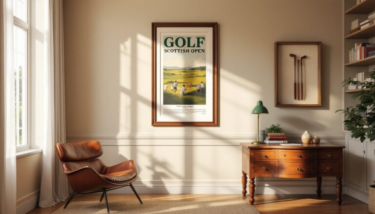
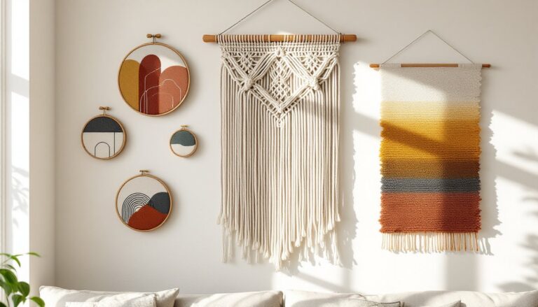
Sophisticated Art and Prints for Kitchen Walls
Art in kitchens fights moisture, temperature swings, and the occasional tomato sauce incident. Choose wisely, mount securely, and skip anything irreplaceable.
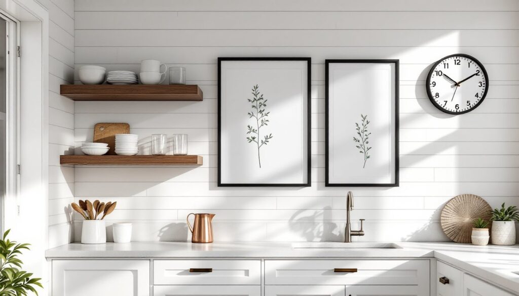
Frame quality and glazing protect the investment. Use frames with UV-protective acrylic or glass to prevent fading, especially near windows. Sealed backs keep moisture out. For prints near the stove or sink, go with acrylic, it’s lighter and won’t shatter if a cabinet door swings too hard.
Subject matter leans subtle. Botanical prints, vintage culinary illustrations, black-and-white photography, and abstract compositions in the kitchen’s color palette all work. Avoid overly literal themes, giant forks, kitschy coffee slogans, or mass-produced “Gather” prints feel dated fast. Designers featured in sophisticated kitchen wall galleries tend toward restrained color palettes and compositions that complement rather than compete with cabinetry.
Mounting hardware needs to hold up in humid conditions. Use rust-resistant D-rings and picture wire for frames over 5 pounds. For drywall, threaded drywall anchors rated for the frame’s weight prevent sagging. If hanging on tile backsplash, adhesive hooks rated for smooth surfaces work for lightweight pieces (under 3 pounds): heavier art requires drilling into grout lines with masonry anchors, not the tile itself, which can crack.
Sizing guidelines: For art above a breakfast nook or small wall section, aim for pieces two-thirds to three-quarters the width of the furniture or wall space below. Too small reads as an afterthought: oversized pieces can overwhelm in tight quarters. A 24×36-inch framed print suits a wall section 36-48 inches wide.
Elegant Open Shelving and Display Options
Open shelving walked the line from trendy to timeless, when done with discipline. It’s functional decor that demands curation and regular maintenance.
Material and finish choices define the look. Solid wood shelves (walnut, oak, maple) at 1.5-2 inches thick convey substance. For a lighter feel, powder-coated steel brackets with wood or glass shelves keep sightlines open. Floating shelves work beautifully but require proper installation: use heavy-duty floating shelf brackets anchored into wall studs with 3-inch wood screws for shelves holding dishware. Drywall anchors alone won’t support the load, expect 30-50 pounds per linear foot for stacked plates and bowls.
Installation specifics: Locate studs with a stud finder (they’re typically 16 inches on center in most homes). Mark level lines with a 4-foot level, even 1/8-inch deviation shows when dishes sit crooked. For shelves between studs, span them with a 1×4 or 1×6 mounting board screwed into multiple studs, then attach the shelf to the board.
Styling with restraint keeps open shelving classy. Group items by color (white dishware, glassware, natural wood cutting boards) or function (baking supplies, coffee station, everyday plates). Leave 25-30% of shelf space empty, negative space prevents visual clutter. Stack plates in sets of 4-6, not towering piles. Mix heights with a few taller items (a pitcher, a vase) among shorter stacks.
Practical considerations: Open shelves collect grease and dust. Plan to wipe them down monthly. Store only items used regularly, this isn’t deep storage. Keep shelves 15-18 inches apart vertically for dinner plates: 12 inches works for glassware and mugs.
Statement Clocks and Functional Wall Decor
A well-chosen wall clock offers sculptural presence and actual utility, a rare combination in kitchen decor.
Scale and placement matter. In kitchens with 10-12 foot ceilings, clocks 18-24 inches in diameter fill wall space without overwhelming. Standard 8-foot ceilings pair better with 12-16 inch clocks. Mount at eye level when standing (58-62 inches to the center) on a wall visible from the main work zones. Above the sink, over a breakfast nook, or on a wall opposite the range all work.
Material and movement affect both style and noise. Silent sweep movements (not ticking quartz) keep kitchens peaceful. Metal frames, wrought iron, brushed steel, antique brass, suit farmhouse and industrial styles. Wood-framed clocks with simple numerals lean traditional. For modern spaces, minimalist designs with no frame or numerals, just metal hands on a painted wall, make a statement through restraint.
Other functional wall decor includes:
- Pot racks and utensil rails: Wall-mounted brass or iron pot racks with S-hooks display copper or cast iron while freeing cabinet space. Mount into studs with lag bolts rated for the combined weight of cookware, figure 50-75 pounds fully loaded.
- Magnetic knife strips: 16-18 inch walnut or stainless strips mounted 36-42 inches above the counter (above elbow height when standing) keep blades accessible and visible. Secure with screws into studs or heavy anchors, magnets hold knives, but the strip itself must support the weight.
- Chalkboard or cork panels: Framed 2×3 foot chalkboard panels serve as menu planners or grocery lists. Use real slate or porcelain chalkboard paint on MDF, not cheap peel-and-stick versions that peel in humid kitchens. Frame in wood that matches cabinetry or shelving.
Timeless Materials: Metal, Wood, and Glass Accents
Material choice signals quality. The right finishes age gracefully: cheap ones just look cheap.
Metal accents bring industrial elegance. Wrought iron brackets for shelves, hammered copper wall hangings, or brushed stainless floating shelves all hold up in kitchen conditions. Avoid unlacquered brass near the stove, it tarnishes fast. Powder-coated steel resists corrosion and comes in matte black, white, or custom colors. For a refined look, match metal finishes to cabinet hardware and faucet finishes.
Wood elements warm stark kitchens. Reclaimed barn wood shelves (actual reclaimed, not distressed pine from big-box stores) add texture and history. Seal with polyurethane or hard wax oil to protect from moisture and staining. Live-edge wood slabs make striking floating shelves, mount with concealed rod brackets drilled into the back edge. Ensure wood is kiln-dried to prevent warping: moisture content should be 6-8% for indoor use.
Glass and mirror expand visual space. Beveled mirror tiles on a small wall reflect light and make tight kitchens feel larger. Antique mirrors with aged patina suit vintage and farmhouse styles but need distance from water sources, mounting behind a range or in a breakfast nook works: directly above a sink invites water spots and frame damage. Framed glass shelves on metal brackets display glassware or small plants without blocking light.
Mixing materials requires a plan. Combining ideas like accent wall treatments with wood shelving and metal hardware works when finishes coordinate. Stick to a 60-30-10 rule: one dominant material (60%), a secondary material (30%), and an accent (10%). For example, white shiplap walls (60%), walnut shelves (30%), and black metal brackets (10%).
Creating a Gallery Wall with Refined Style
Gallery walls in kitchens walk a fine line, curated but not precious, cohesive but not matchy. Execution separates elegant from chaotic.
Planning the layout starts on the floor, not the wall. Arrange frames on kraft paper templates cut to size, then tape the templates to the wall with painter’s tape. Adjust until spacing feels balanced, 2-3 inches between frames keeps things cohesive without crowding. Mark nail holes through the paper, remove templates, and hang.
Frame consistency simplifies the look. Minimalist designs often feature refined gallery approaches with uniform frames in one finish, all matte black, all natural wood, or all thin metal. For eclectic styles, vary frame sizes but keep finishes within one family (all warm metals, all cool metals, all wood tones). Mat boards create breathing room inside frames and elevate inexpensive prints, use acid-free mats to prevent yellowing.
Content curation avoids theme overload. Mix vintage botanical prints, black-and-white family photos, abstract line drawings, and one or two three-dimensional objects like a small shelf or vintage utensil. Don’t turn it into a museum of kitchen kitsch, no wooden spoons, enamelware, or “Coffee” signs.
Hanging hardware and weight distribution: Use picture-hanging wire for frames over 2 pounds: sawtooth hangers work for lightweight pieces but can shift over time. For heavier frames (over 10 pounds), use two hooks spaced 8-12 inches apart for stability. Always anchor into studs for large or heavy groupings. If designing near a kitchen remodel, plan the gallery wall after cabinets are installed so it integrates with the finished layout.
Lighting enhances the gallery. Battery-powered LED picture lights clipped to frame tops add drama without requiring an electrician. For permanent installations, hardwired picture lights (installed by a licensed electrician per NEC requirements) provide even, adjustable illumination.
Conclusion
Classy kitchen wall decor doesn’t shout, it anchors. Quality materials, intentional placement, and a bias toward function over filler create walls that enhance rather than distract. Whether installing floating shelves, curating a gallery wall, or selecting a statement clock, the goal stays the same: layers of visual interest that respect the kitchen’s working rhythm. Start with one well-chosen element, ensure it’s properly mounted, and build from there. The best kitchen walls evolve, not all at once.